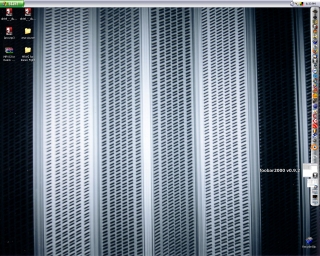
Ever since reading this post about moving the Start menu to the top of the screen, I’ve occassionally considered it. I’ve also often found myself wishing that the Quick Launch toolbar in Windows behaved a bit better so that I could actually have it set on auto-hide and not have it jump out every time I try to use the scroll bar on a full screen program. In fact, I found myself wishing it would behave more like the Dock on a Mac. Well, recently I came across a program called RocketDock that emulates the Dock on a Mac and also is as customizable as the Quick Launch toolbar (moreso, actually).
It hasn’t broken my computer yet, so I feel pretty good about recommending it to people who maybe wish their PC was more like a Mac. One nice feature is that you can set it so that when you minimize something it becomes an icon in the dock and disappears from the Start bar. This helps keep the Start bar uncluttered when there are a lot of programs open but many of them are minimized. One down side to this is that when an icon does the little bounce thing to get your attention, it doesn’t bounce onto the screen. This means you have to periodically check the dock to see if any of your minimized windows are trying to get your attention, like an IM window or something.
Since I now I have Dock-like shortcut bar, I thought I’d just go whole hog and move the Start bar up to the top of the screen. It’s a little strange, but not so bad. I’ve locked it so it doesn’t have the funky looking beveled edge that it does when it’s resizable. The other thing I’m trying to retrain myself on is using the button on the side of my mouse to bring up an the application switcher instead of mousing up to the top of the screen and clicking on the program tab, or worse, mousing over to make the dock appear so I can click on a minimized window. If I’m switching back and forth between two programs, which is often the case when I’m working on the port or the unit test suite for the port, all it takes is two clicks of the mouse button to switch to the window I want.
I’m not entirely sure what it means to be rocking such a faux-Mac desktop. Maybe it just means that OSX has a better UI. In any event, it’s a nice change of scene and will hopefully reduce some unecessary mousing around and clicking.
